
Mortal Kombat Logo, Co-Creator Explains How They Created It

The Mortal Kombat franchise has been entertaining us for decades. Whether in video games, movies, or animated series. The franchise was born in 1992, thanks to Ed Boon and John Tobias, with four first video games, but little do we know about the Mortal Kombat logo. One game’s creator, John Tobias, recently posted some details about the game’s development on his Twitter account. The origin of its distinctive logo, the inspiration that led to making it that way, the first sketches, and why the logo is a dragon.
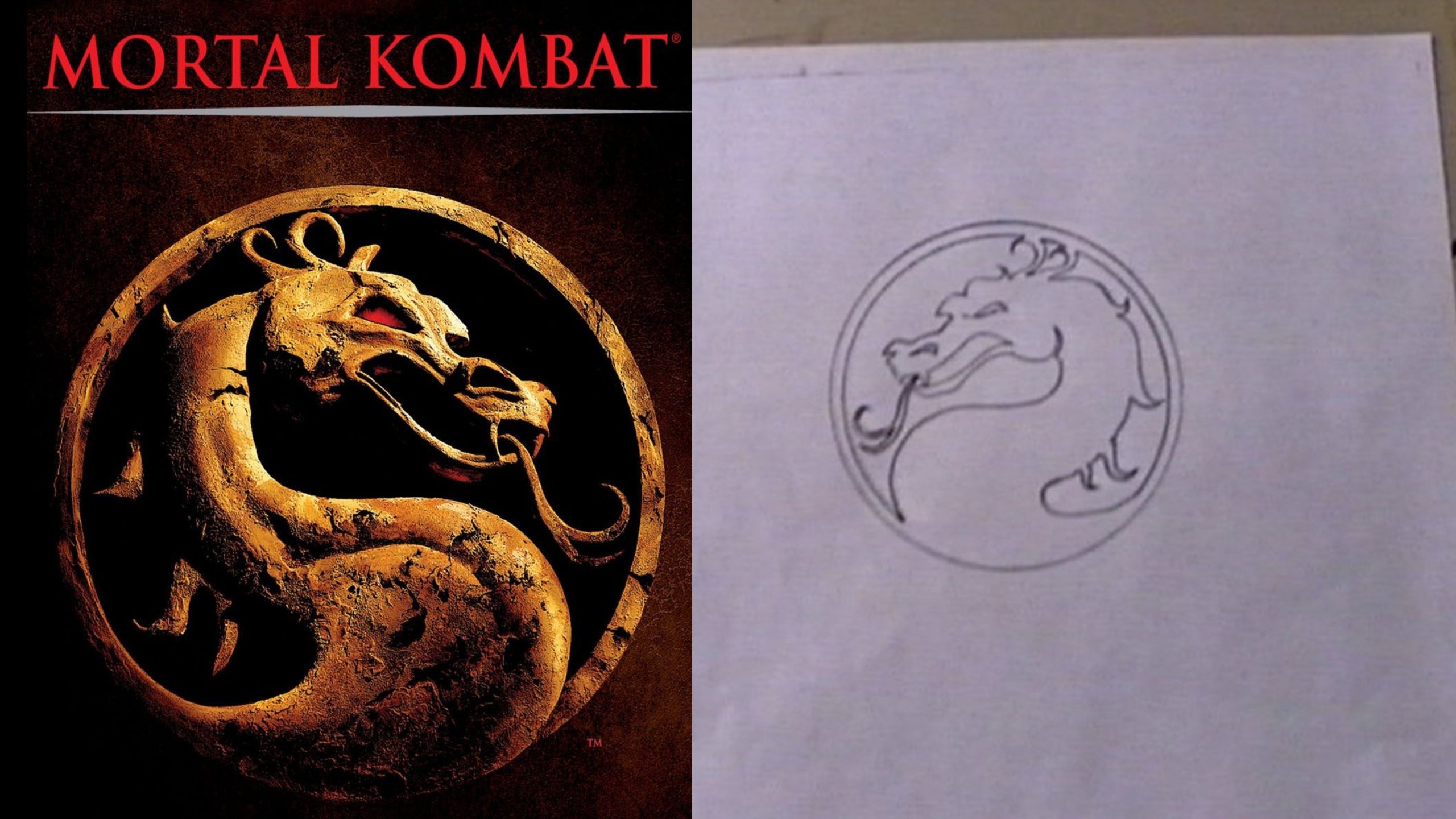
Tobias published a hand drawing of the original logo, stating that he almost broke it the first time, as it looked more like a sea horse than a dragon. He explained that this icon was related to the initial name the game would have. Although the creators later changed this to Mortal Kombat, the Dragon stayed.
Another detail that Tobias explained was the element that inspired him to create the logo that way. He also explained how he developed it until it became the image we know today.
Mortal Kombat Logo, Co-Creator Explains How They Created It
 Image: NetherRealm Studios
John Tobias explained how they created the game back in 92, which users could play on the NES console and Arcade machines at the time. The main reason for the Dragon is that the prototype name of the game was not Mortal Kombat but Dragon Attack. That’s why a dragon was initially thought of, which remains to this day as the Mortal Kombat logo.
Tobias stated in this regard, “The inspiration for using a dragon as the symbol of the fictional tournament came from ‘Dragon Attack’, which was in contention as the title of our game before and I changed it to ‘Mortal Kombat’.” The name Dragon Attack was initially proposed because of a song by Ed Boon called Love of the Queen.
The name would change to Mortal Kombat, by Boon’s own decision. It had a wide success in the Arcade machines, leading it to be the global best-selling fighting game franchise. It has so far sold 73 million units, surpassing Marvel Vs. Capcom, Tekken, and Super Smash Bros.
This franchise inspired two movies, in 95 and 97, starring Liu Kang, Raiden, Johnny Cage, and Ana. They had to fight in Mortal Kombat to save the earth from wizards and supernatural beings who sought to conquer it by any means. These productions divided the critics between those who loved and hated them.
After the failures of the previous movies, in 2021, Warner Bros. had another version. The plot was similar, with Raiden recruiting fighters who will participate in the tournament. The main protagonist is not Liu Kang but a fighter named Cole, a descendant of Scorpion, who, to a surprise, is part of the team of the good guys.
The Twitter Thread Where John Tobias Explains It
Here’s a recently discovered image of the very first drawing of #MortalKombat’s dragon icon. I designed the icon as both a symbol of our game and its fictional tournament… (thread) #MK30 pic.twitter.com/vVIDr4K9aP
— John Tobias (@therealsaibot) September 22, 2022
In the Twitter post, Tobias explains in great detail the origin of the game, name, and logo of Mortal Kombat. This author initially showed how they had drawn the game’s name as Dragon Attack. Also, several drawings with people wrapped in a dragon were the basis for decorating the arcade machines.
As for the origin of the logo states that the inspiration came from a gold statue that John Voguel saw. This image of a dragon became an obsession, generating the current logo.
Tobias said, “The inspiration for the dragon icon design began when John Vogel saw a gold statue of a dragon on the desk of Midway’s general manager, Ken Fedesn”. Tobias added, “John borrowed it to digitize and use in our game backgrounds.”
The game’s co-creator added, “I had been thinking about creating an icon to represent the fictional tournament, but also to brand the game with a symbol…like Superman’s “S” or Batman’s bat symbol.” The author continued, “I used the dragon from the sketch on the side panel of my cabinet to inform the look of the dragon icon as our symbol.”
 Image via HBO Max.
As a fun fact, the original Mortal Kombat logo faced both right and left. It would stay that way until Mortal Kombat II, as in this edition, it was changed to meet right only. Tobias commented on this detail “We chose to face right and it’s been that way ever since.”
He culminated with the details of the logo saying, “The final design of the icon was an attempt to replicate the yin yang symbol, which represented the balance of the furies, a central part of early MK fiction.”
Featured Image Via NetherRealm Studios
I am a circus aerialist influenced by Dick Grayson and Spider-Man. Fortunate to write about the characters that inspired me. I also have a Bachelor's degree in Political Science and a Master's degree in International Trade.


Leave a comment